
VINÍCOLA RAVANELLO - ESPUMANTE E VINHO RESERVA
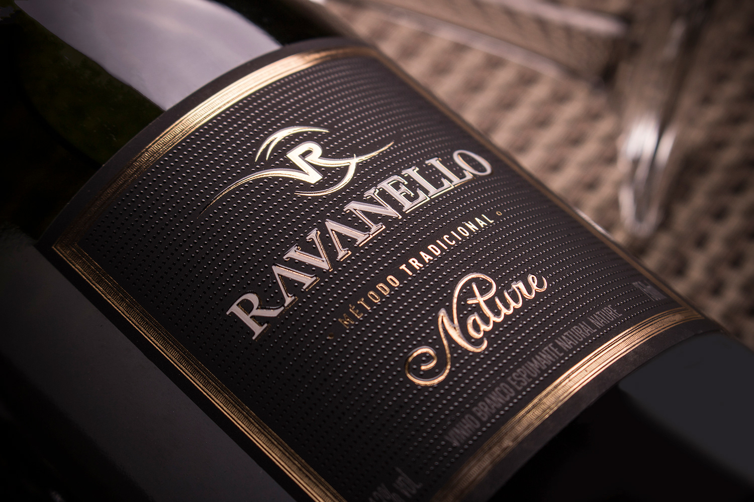
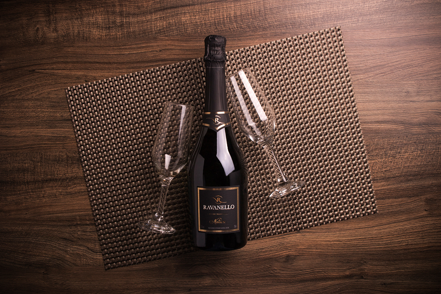
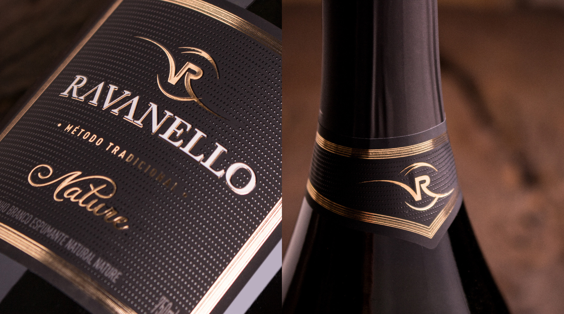
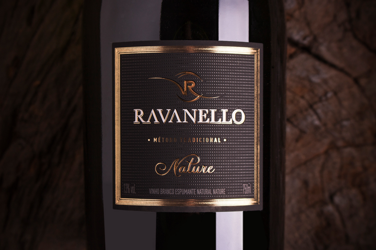
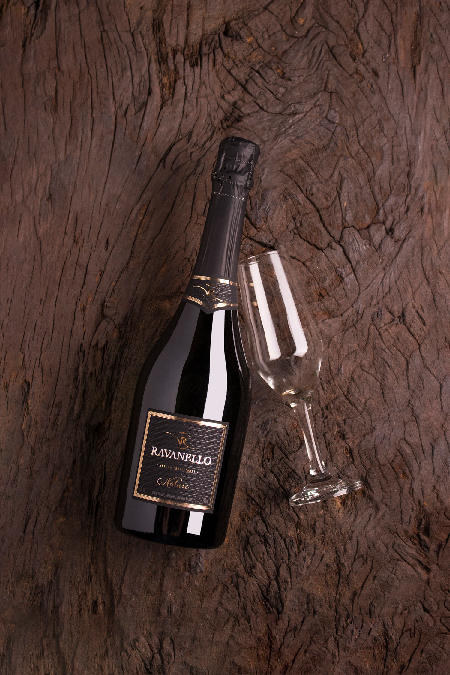
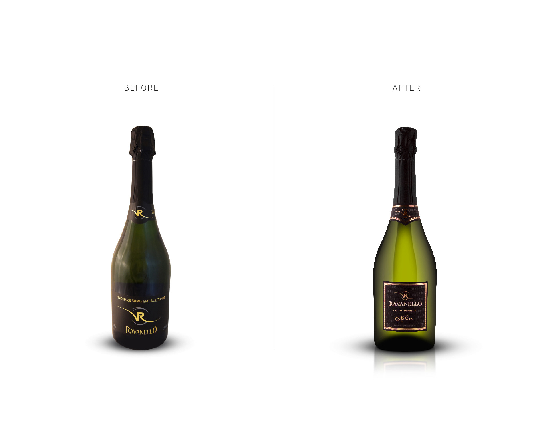
A Vinícola Ravanello, localizada na cidade turística de Gramado, na Serra Gaúcha, propõe um posicionamento de produtos com valor agregado de alto padrão de qualidade, diferenciação no modo produtivo com materiais nobres e de ponta, oferecendo experiências marcantes para quem a visita. Seu espumante BRUT passou a se caracterizar como NATURE, e para essa mudança, um novo rótulo precisava ser desenvolvido. Com linhas marcantes e acabamentos em relevo e metalizado, lembrando um quadro antigo, desenvolvemos a identidade visual da linha de espumantes, repaginando-a de tal forma para que possuísse um design elegante e funcional, com materiais refinados, sem perder a durabilidade e o requinte.
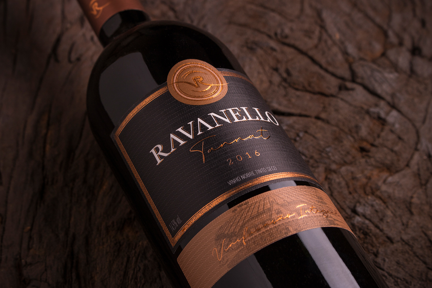
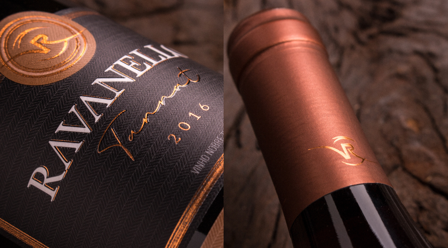
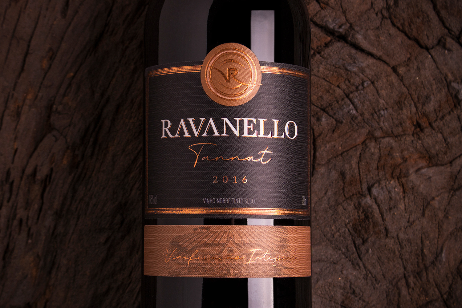
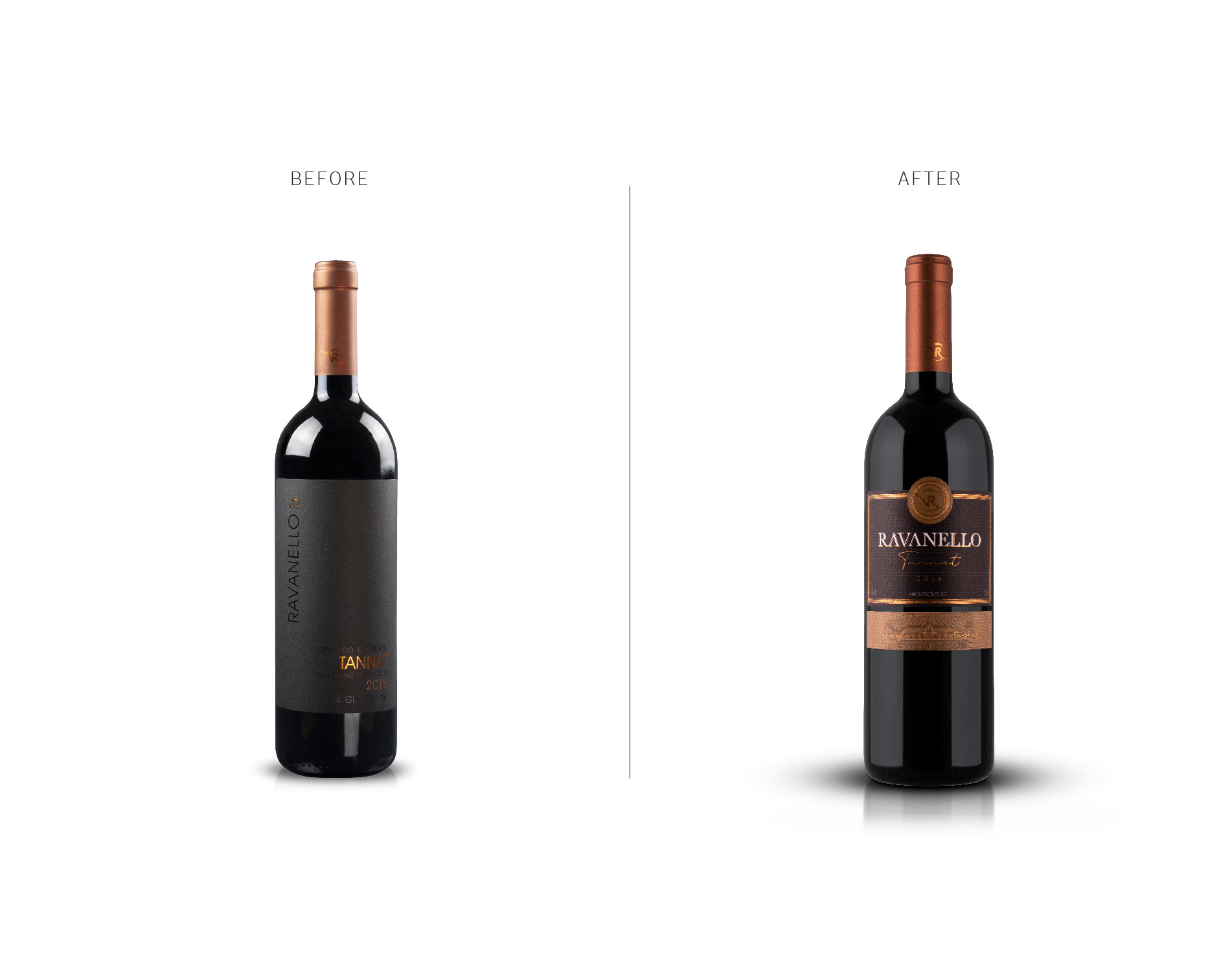
Da mesma forma, seus vinhos reserva possuíam rótulos requintados e limpos, porém os consumidores e apreciadores dos produtos reserva da vinícola tinham dificuldade em ler e entender que produto estavam adquirindo. Por esse motivo, optou-se em redesenhar a linha para que ficasse próxima aos espumantes, com acabamentos metalizados e relevos, deixando o produto com melhor legibilidade das informações e também repassar os valores do produto como a forma de sua produção.
Da mesma forma, seus vinhos reserva possuíam rótulos requintados e limpos, porém os consumidores e apreciadores dos produtos reserva da vinícola tinham dificuldade em ler e entender que produto estavam adquirindo. Por esse motivo, optou-se em redesenhar a linha para que ficasse próxima aos espumantes, com acabamentos metalizados e relevos, deixando o produto com melhor legibilidade das informações e também repassar os valores do produto como a forma de sua produção.
WINERY RAVANELLO - SPARKLING WINE AND WINE RESERVE
The Ravanello Winery, located in the tourist city of Gramado, in the Serra Gaúcha, proposes a positioning of products with added value of high quality standard, differentiation in the productive mode with noble and cutting-edge materials, offering experiences remarkable for those who visit it. Its BRUT sparkling wine came to characterize itself as NATURE, and for this change, a new label needed to be developed. With striking lines and embossed and metallized finishes, remembering an old frame, we developed the visual identity of the sparkling wine line, repaginating it in such a way that it had an elegant and functional design, with refined materials, without losing the durability and refinement.
Similarly, its reserve wines had exquisite and clean labels, but consumers and connoisseurs of the winery's reserve products had difficulty reading and understanding which product they were acquiring. For this reason, we chose to redesign the line so that it was close to sparkling wines, with metallized finishes and reliefs, leaving the product with better readability of the information and also passing on the values of the product as the form of its production.without losing the durability and refinement.
Similarly, its reserve wines had exquisite and clean labels, but consumers and connoisseurs of the winery's reserve products had difficulty reading and understanding which product they were acquiring. For this reason, we chose to redesign the line so that it was close to sparkling wines, with metallized finishes and reliefs, leaving the product with better readability of the information and also passing on the values of the product as the form of its production.without losing the durability and refinement.

Client: Vinícola Ravanello
Project: Label Design
Images: Bagual Studio
Project: Label Design
Images: Bagual Studio