
ORAZIO CAFÉ ESPECIAL - EMBALAGEM
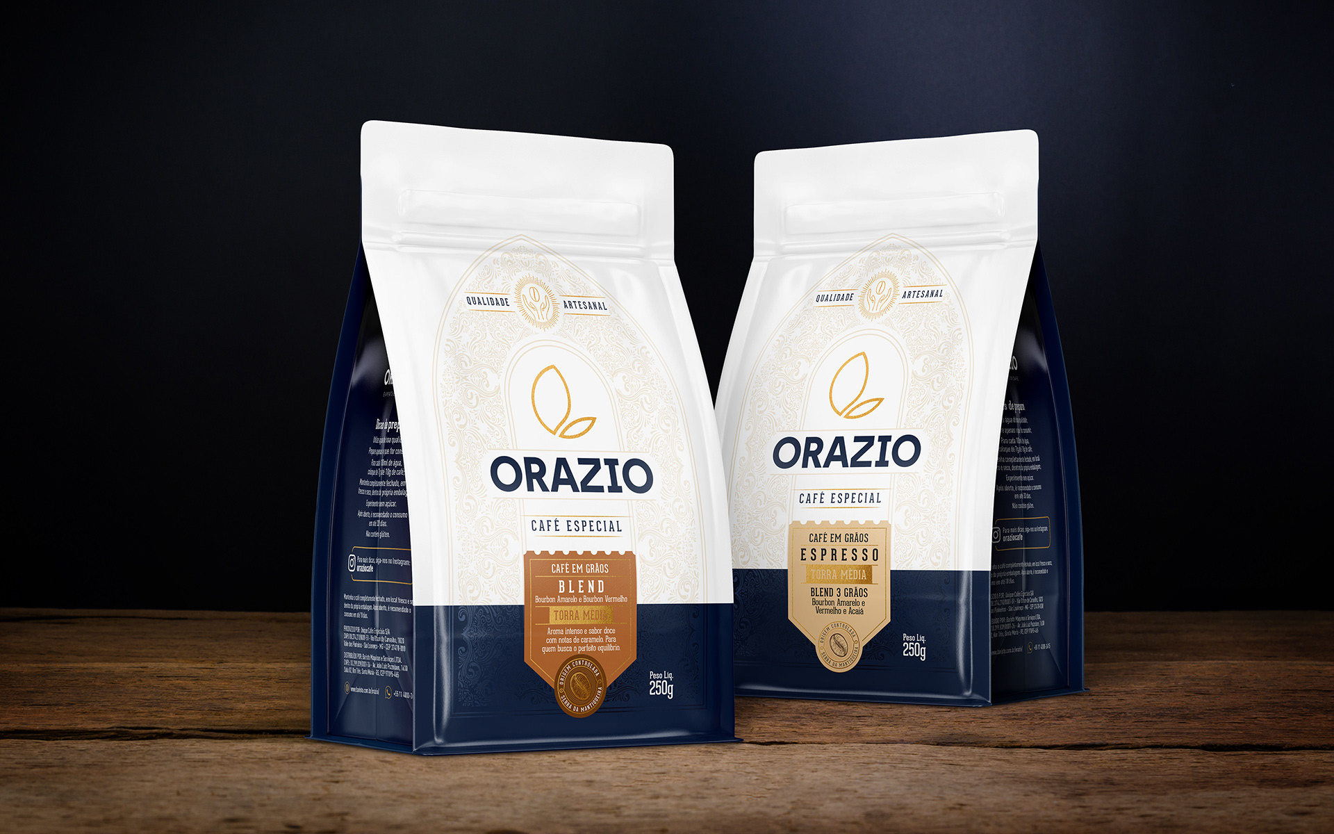
A Orazio é expert em café, com amplo conhecimento e atendendo diversas cafeterias e restaurantes. Para desenvolver este projeto, o desafio foi trazer essa expertise em um produto prático, em uma embalagem de 250g, para uso dos amantes de café no dia a dia, por isso o slogan Você Expert em Café.
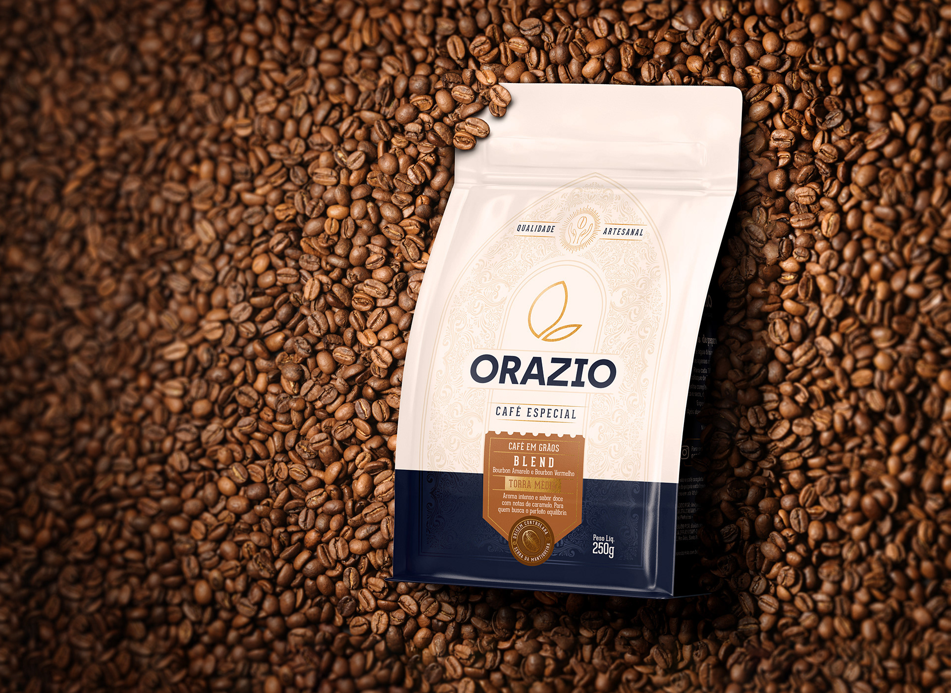
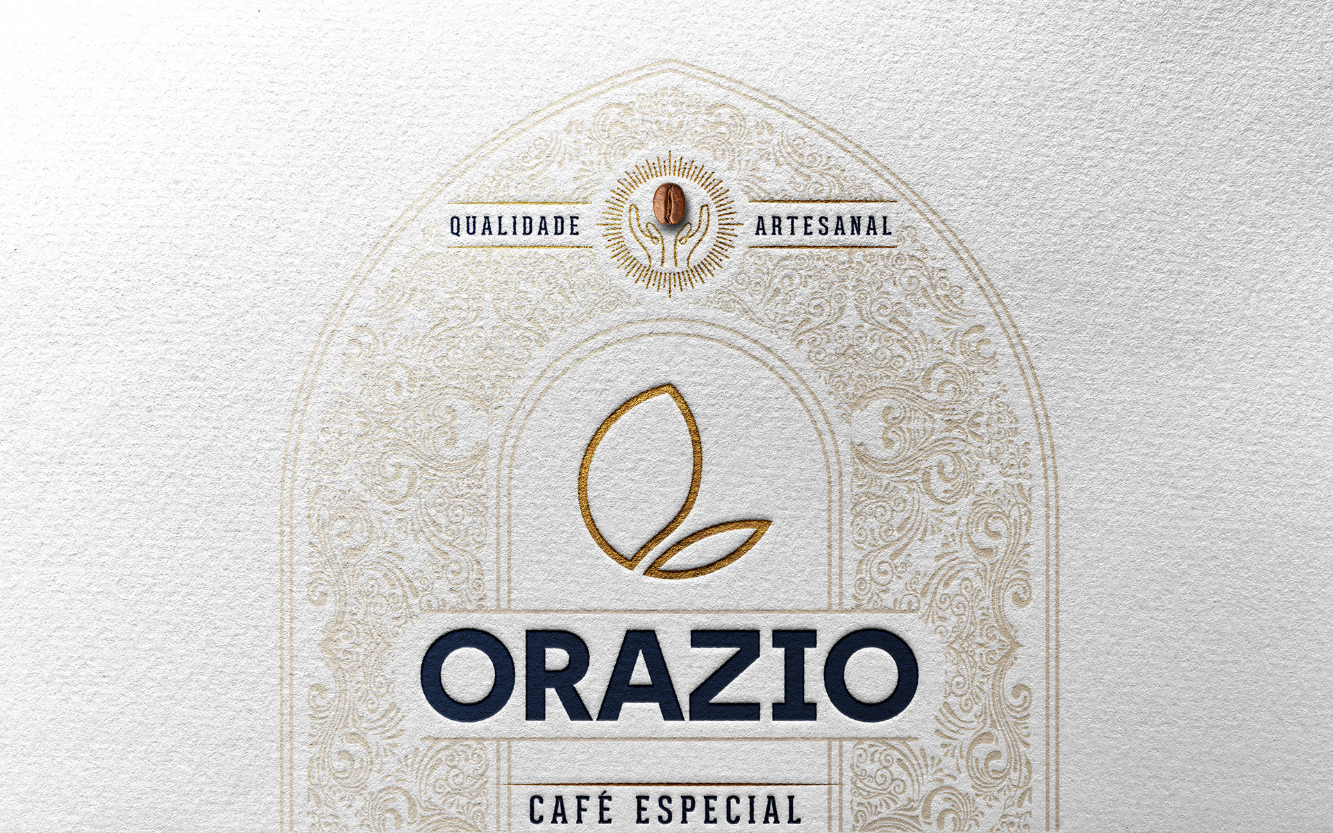
O design da embalagem traz a cor azul petróleo da marca com grafismos sutis no fundo que convergem nas mãos envoltas ao grão do café, valorizando a qualidade artesanal, enaltecendo a matéria prima e também a forma como o produto é apresentado, em grãos, algo que resulta numa das melhores formas de preparo desta bebida, desde a moagem, até o tempo de extração e a cremosidade do produto final.
A embalagem traz as cores padrões da marca e com detalhes em dourado metalizado, em metalizado também aplicamos os arabescos na parte azul da frente, um tom sobre tom, para ter a sutileza e elegância que o produto exige. A variedade é aplicada através de uma etiqueta com um formato diferenciado, portanto a base da embalagem é a mesma para otimizar o custo e estoque. É a etiqueta que identifica através das cores e ao mesmo tempo certifica a origem da Serra da Mantiqueira, uma procedência mundialmente conhecida pela excelência de seus cafés.
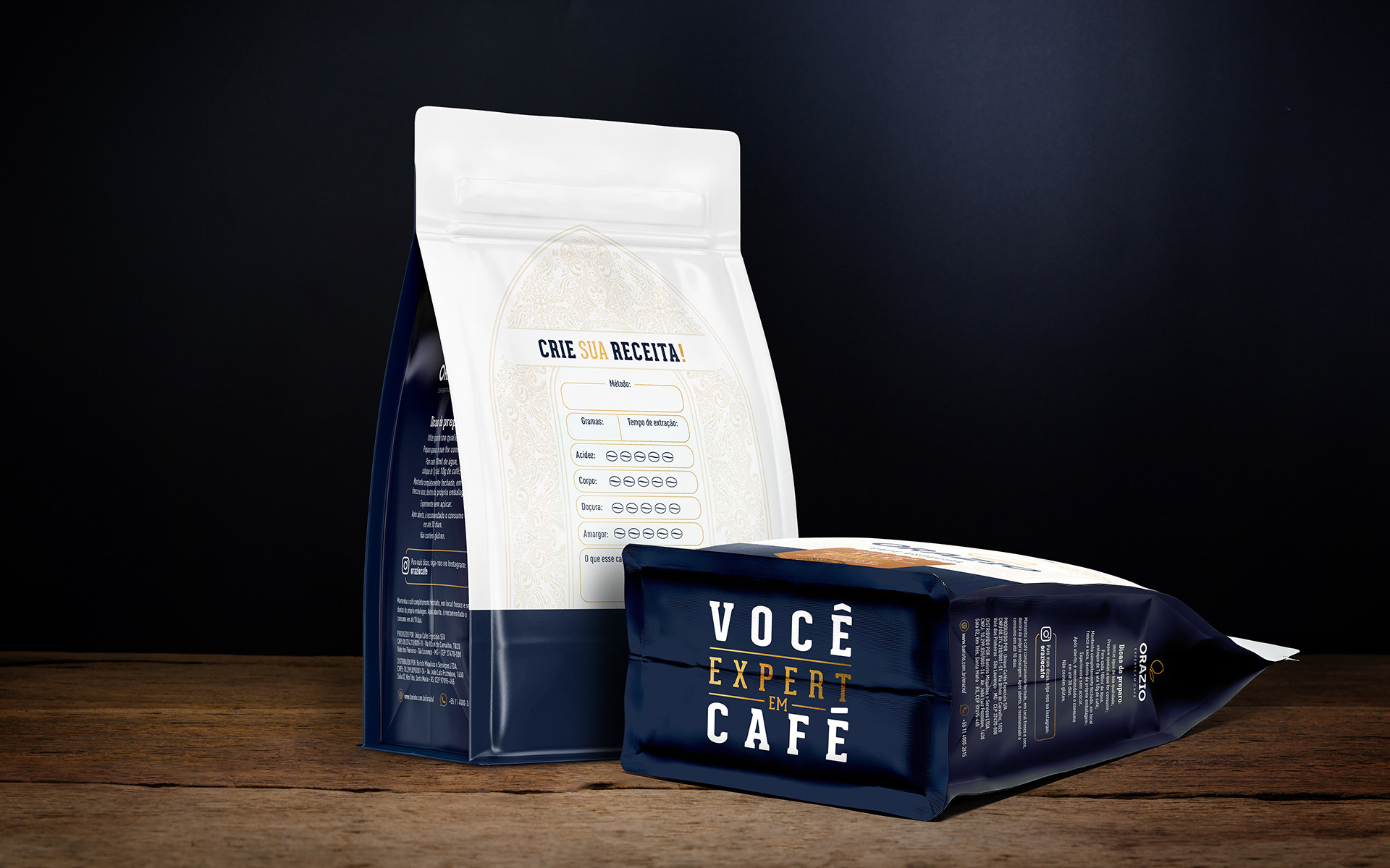
No verso da embalagem uma área interativa, onde o consumidor pode criar sua própria receita, anotando a forma como foi preparado e as percepções pessoais do café.
ORAZIO SPECIALTY COFFEE - PACKAGING
Orazio is a coffee expert, with extensive knowledge and serving various coffee shops and restaurants. To develop this project, the challenge was to bring this expertise to a practical product, in a 250g package, for everyday use by coffee lovers, hence the slogan "You, the Coffee Expert."
The packaging design features the brand's petrol blue color with subtle graphics in the background that converge on hands wrapped around the coffee bean, highlighting the artisanal quality, praising the raw material and also the way the product is presented, in beans, which results in one of the best ways to prepare this beverage, from grinding to extraction time and the creaminess of the final product.
The packaging features the brand's standard colors with metallic gold details. We also applied metallic arabesques to the blue part of the front, a tone-on-tone effect, to achieve the subtlety and elegance that the product demands. The variety is applied through a label with a different format, therefore the base of the packaging is the same to optimize cost and stock. It is the label that identifies through colors and at the same time certifies the origin of Serra da Mantiqueira, a region known worldwide for the excellence of its coffees.
On the back of the packaging there is an interactive area, where the consumer can create their own recipe, noting how it was prepared and their personal perceptions of the coffee.
Client: Baristo - Orazio
Project: Packaging
Images: Bagual Studio
Project: Packaging
Images: Bagual Studio