VINÍCOLA CASACORBA
No setor vitivinícola, com um mercado altamente competitivo, principalmente com a chegada dos vinhos importados, cresce gradativamente a necessidade de criar valores de marca para os produtos e serviços que as empresas oferecem.
O conceito baseia-se em três princípios: CONTINUIDADE, SIMPLICIDADE E ELEGÂNCIA. Por quê?
A vinícola por ser de perfil familiar, prega conceitos como união, trabalho em família e herança da cultura com o trabalho da uva. Seu nome CASACORBA é o nome do distrito da província de Treviso na Itália, de onde os imigrantes da família Tessaro imigraram, assim homenageando-os. Partindo desse princípio, o reposicionamento consiste na união de duas letras C, formando um símbolo infinito que fortalece os conceitos acima citados. A identidade visual é baseada em patterns criados a partir do símbolo da marca e replicados na sua identidade visual.
CASACORBA WINERY
In the wine sector, with a highly competitive market, especially with the arrival of imported wines, the need to create brand values for the products and services that companies offer gradually grows.
The concept is based on three principles: CONTINUITY, SIMPLICITY AND ELEGANCE. Why is that?
The winery because it is family profile, preaches concepts such as union, family work and heritage of culture with grape work. Its name COATRBA is the name of the district of the province of Treviso in Italy, from where the immigrants of the Tessaro family immigrated, thus honoring them. Starting from this principle, the repositioning consists of the union of two letters C, forming an infinite symbol that strengthens the concepts mentioned above. Visual identity is based on patterns created from the brand symbol and replicated in your visual identity.
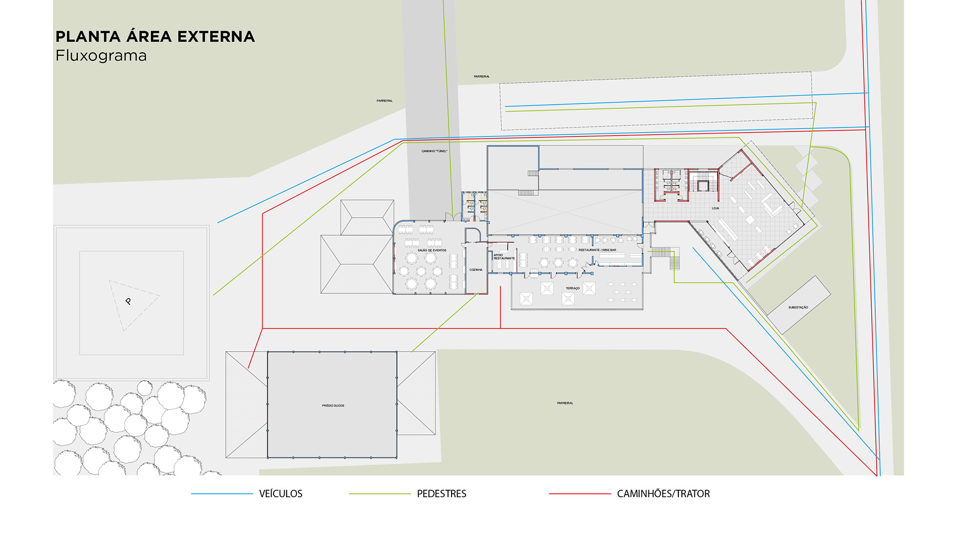
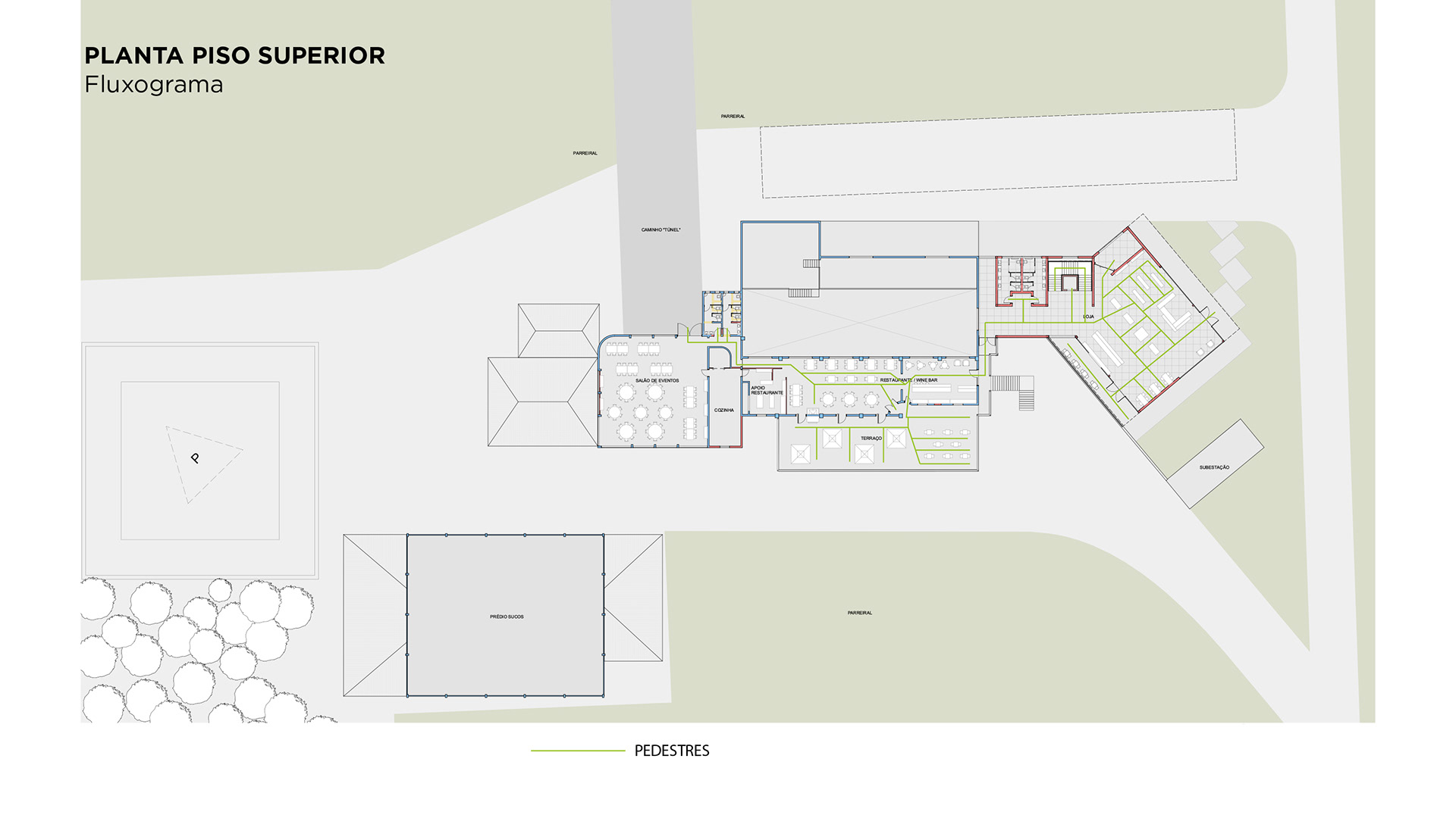
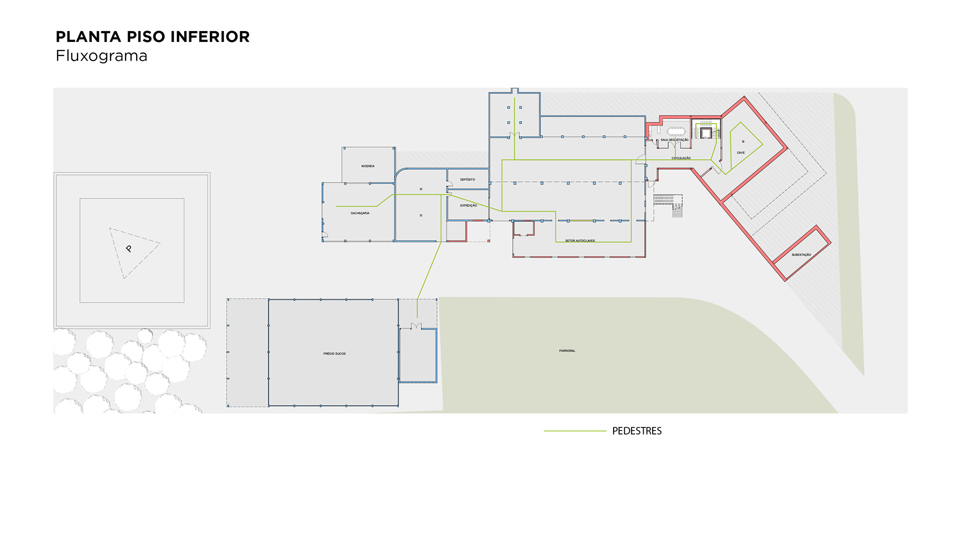
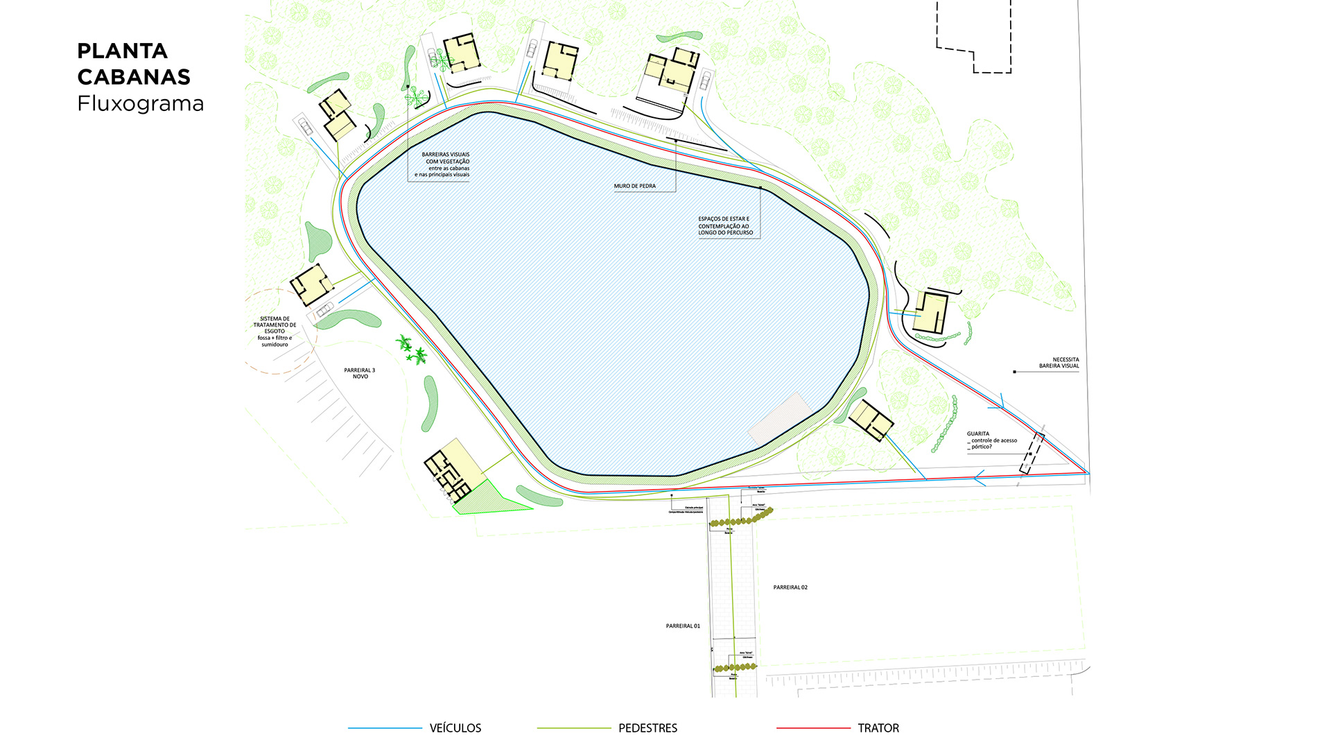
Client and images: Casacorba Vinhos e Espumantes
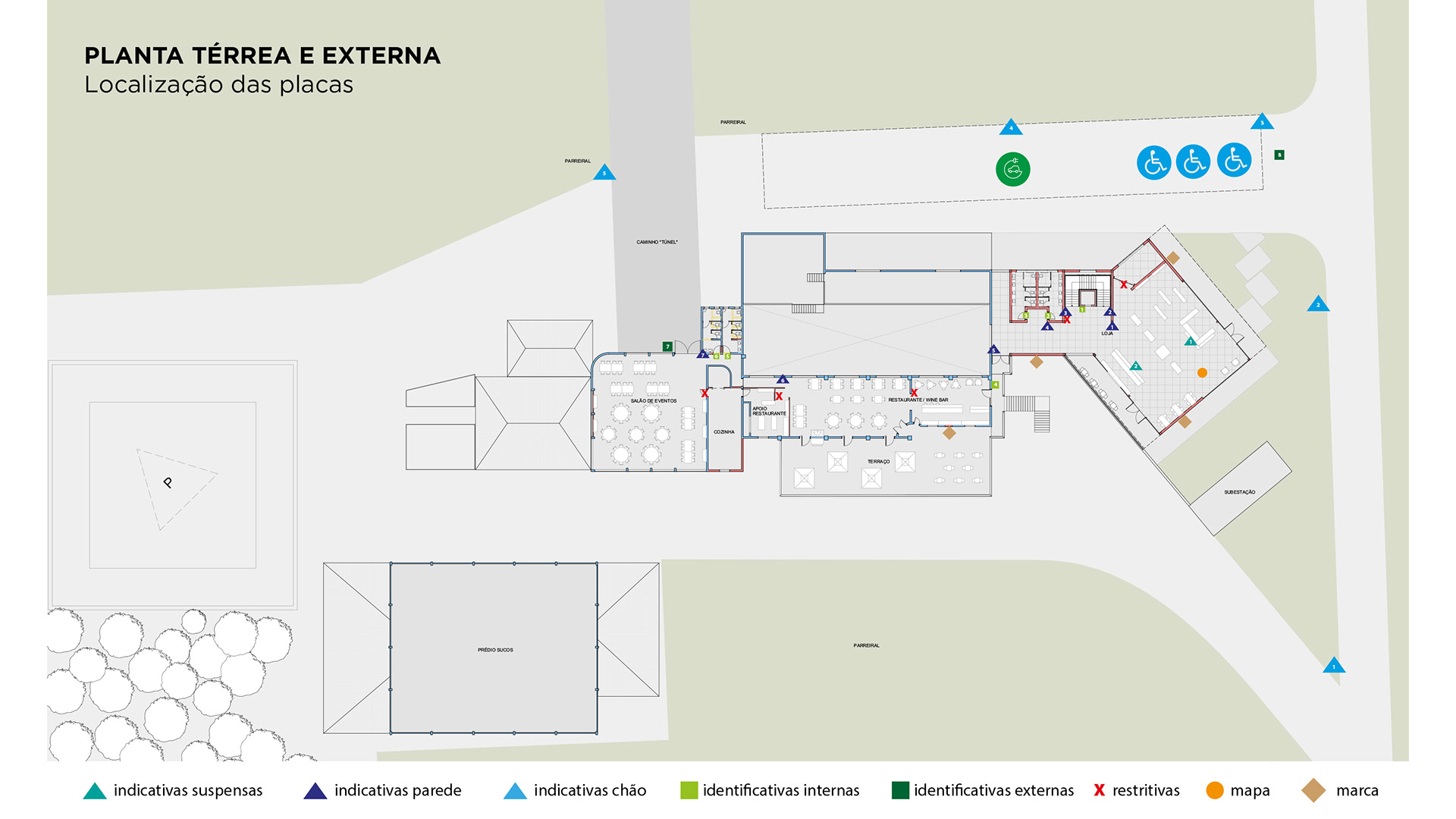
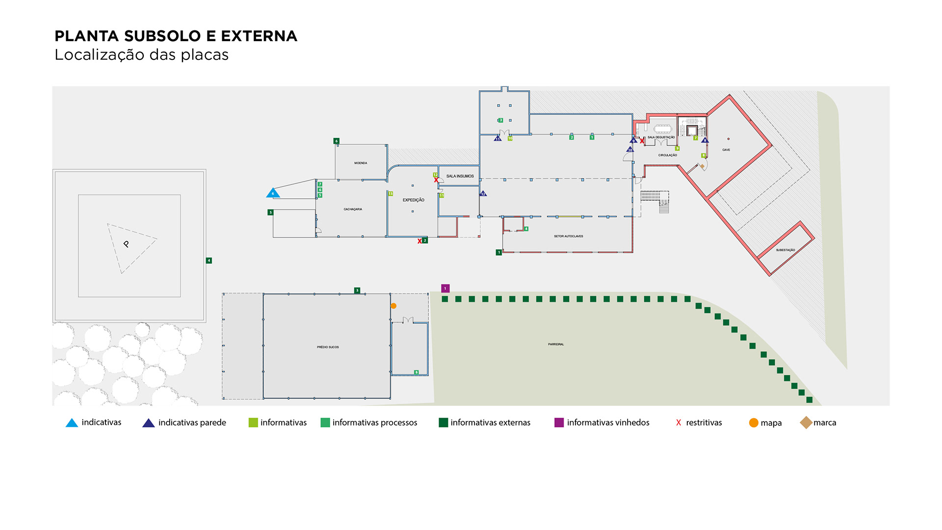
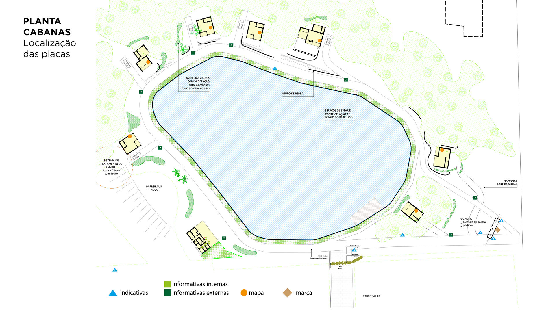
Project: Brand / Visual Identity / Wayfinding
Project: Brand / Visual Identity / Wayfinding
