
AZOR - ESTÂNCIA PARAIZO - RÓTULOS
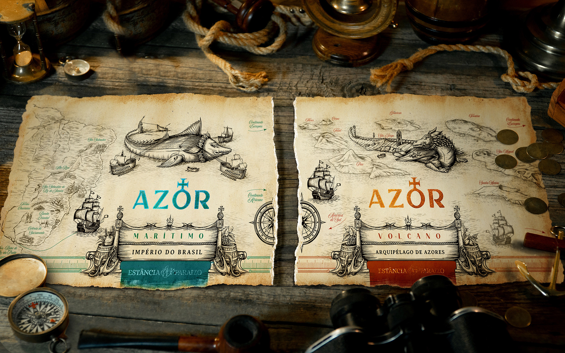
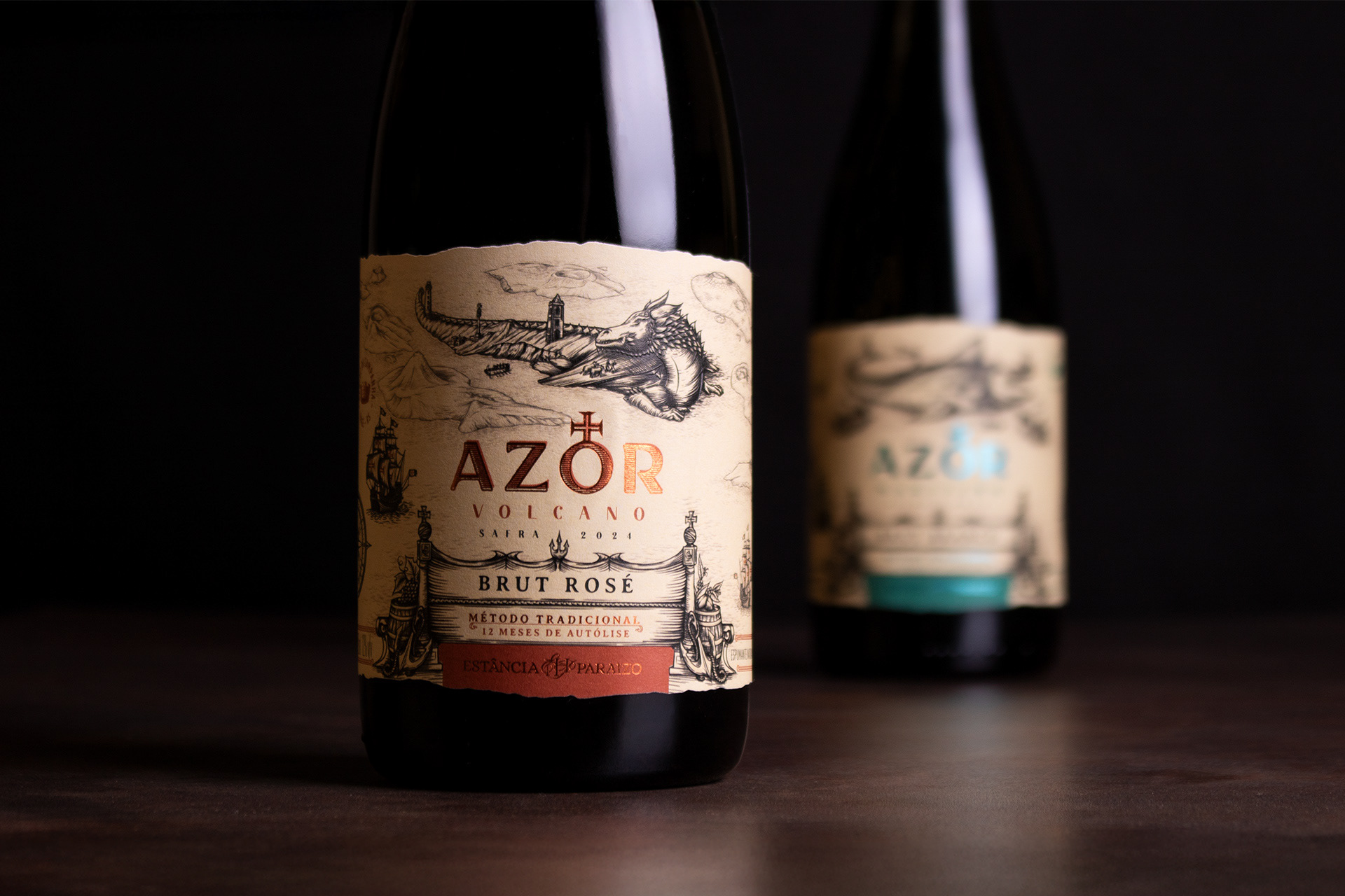
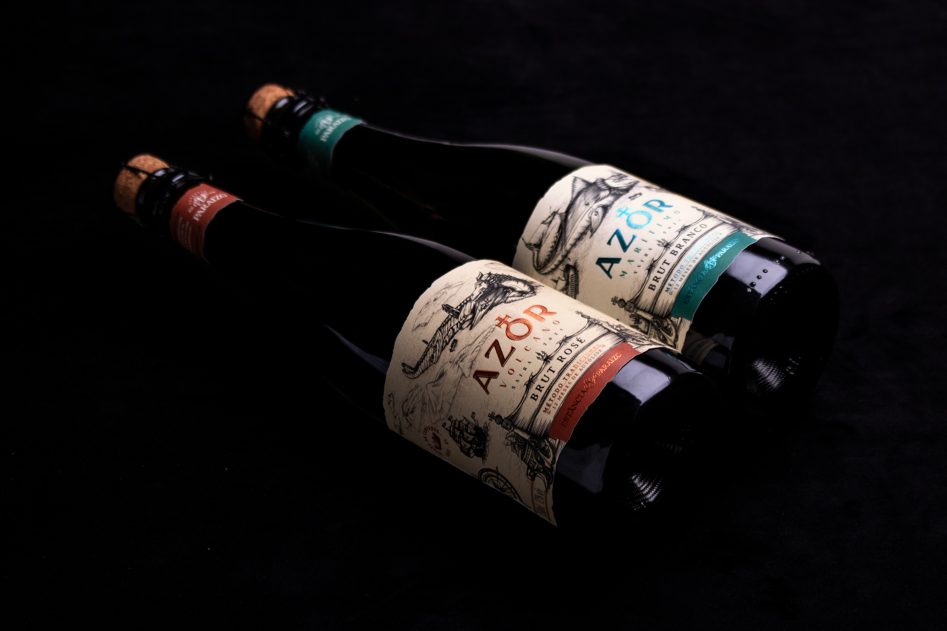
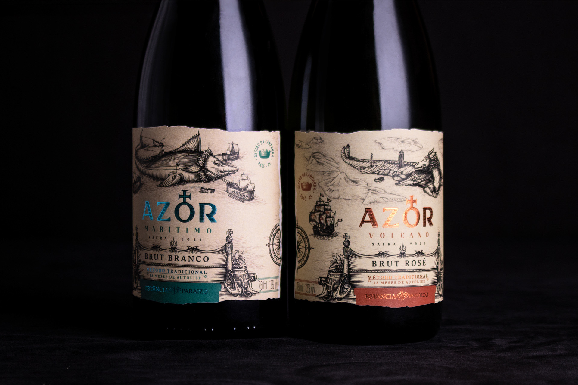
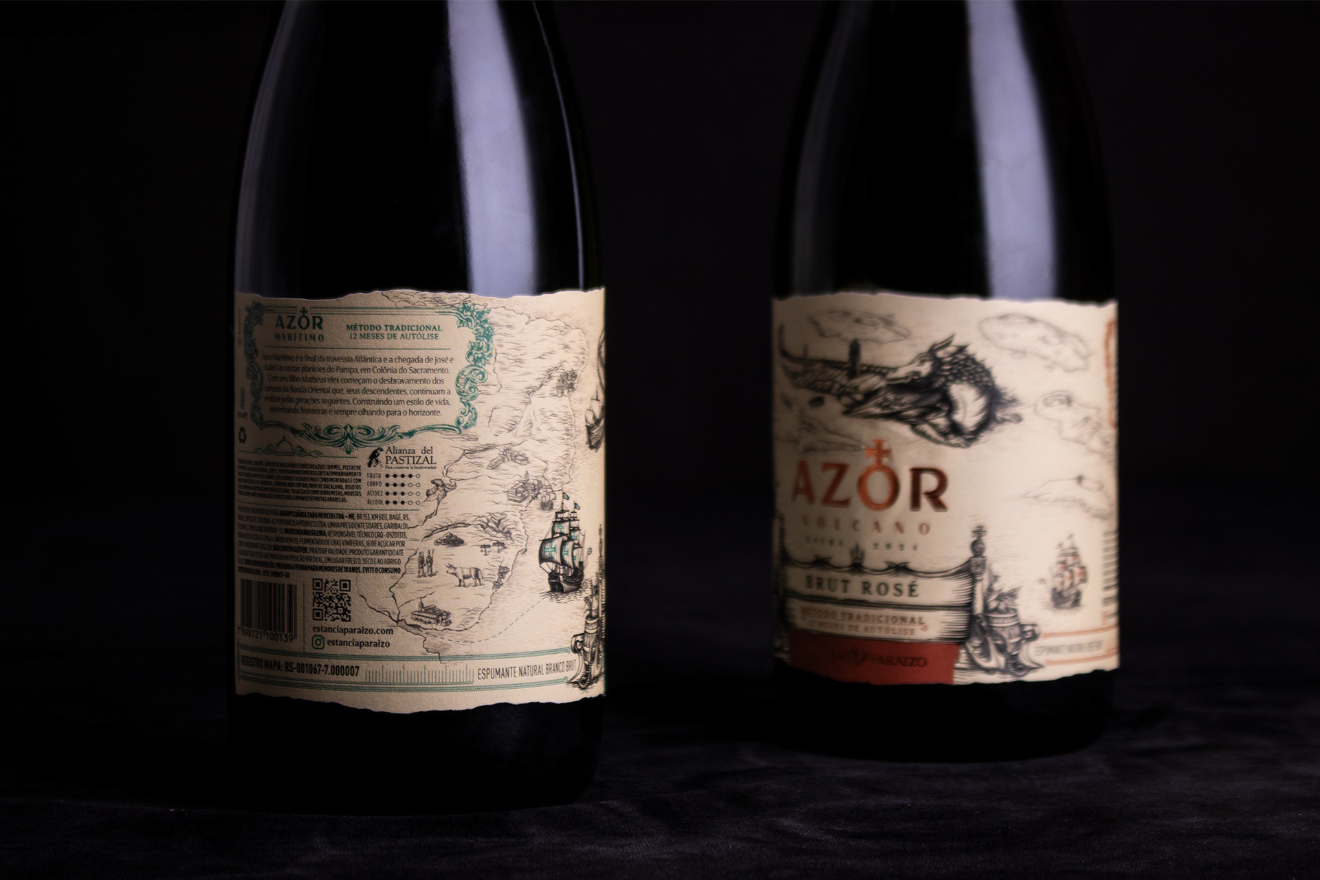
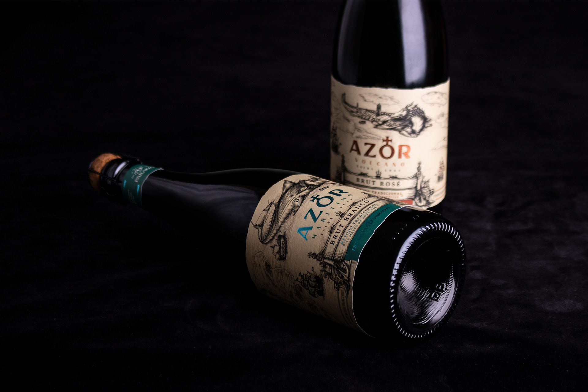
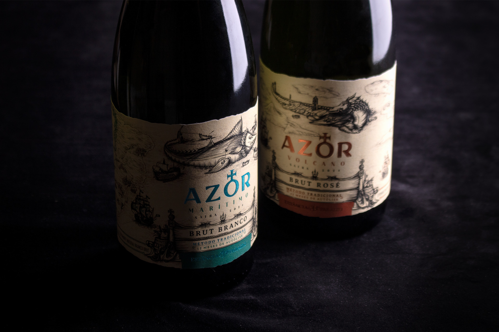
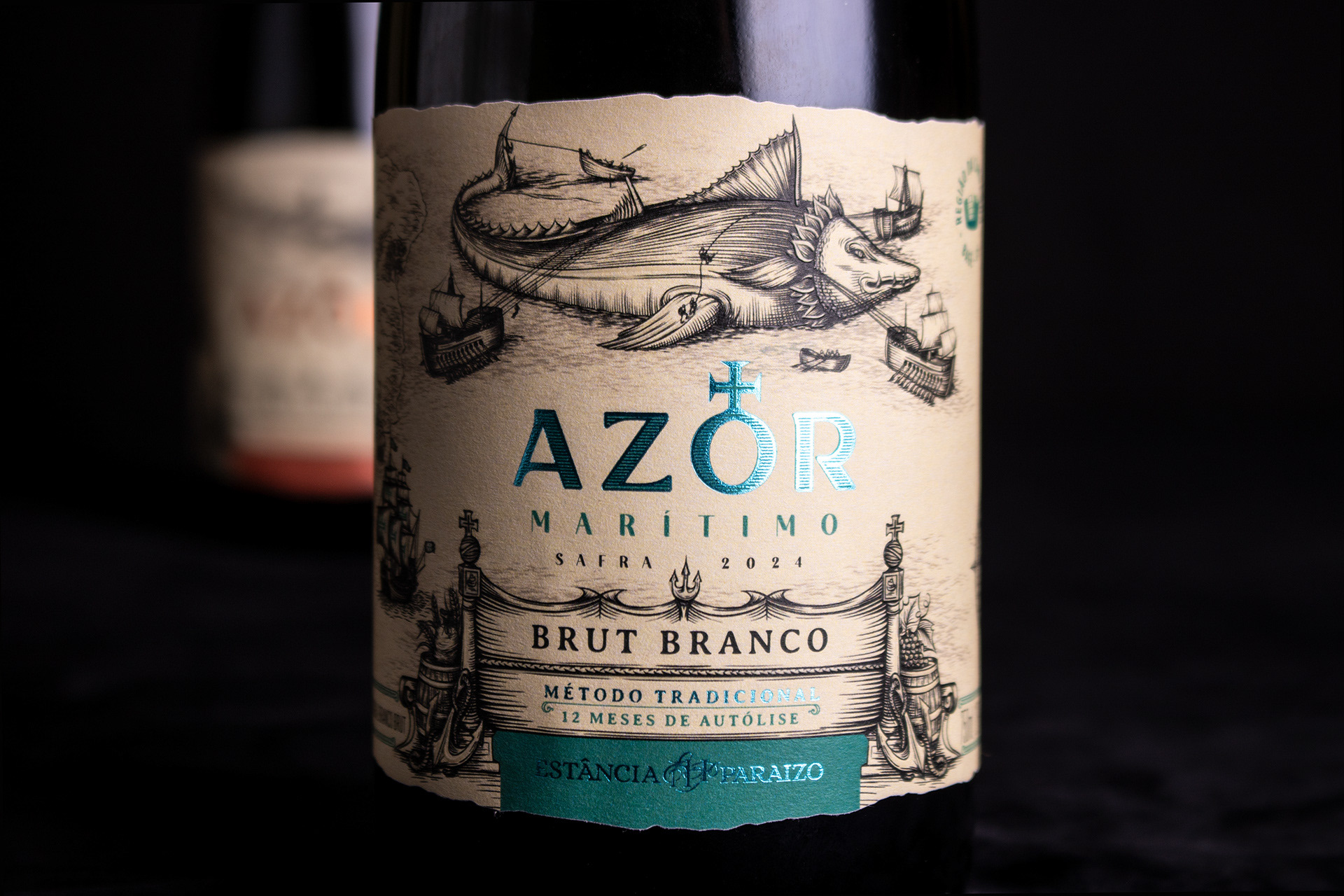
Os rótulos Azor Volcano e Azor Marítimo nascem como duas partes de uma mesma narrativa: a origem e a epopeia da família Mercio, desde o Arquipélago dos Açores, em meio ao Oceano Atlântico, até o sul do Brasil. Inspirados nos mapas antigos dos séculos XVI e XVII, período das grandes navegações, os rótulos se estruturam como duas partes de um mapa, onde cada garrafa revela um capítulo dessa história de superação, coragem e pioneirismo.
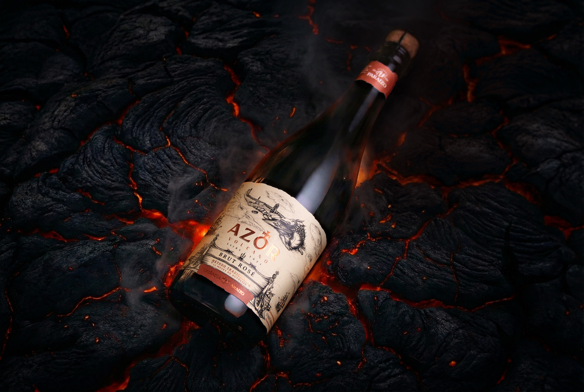
No Azor Volcano, a história começa na terra natal, o arquipélago com 9 ilhas, com destaque para a ilha de São Jorge. O dragão que ilustramos, faz parte do terreno, transformando-se na própria ilha. Tanto o dragão como o vulcão, permitem que as pessoas construam, cultivem e vivam na sua superfície, porém tem força em qualquer momento para entrar em erupção e clamar pelo seu território e hegemonia. Elementos simbólicos das navegações portuguesas, como a Esfera Armilar e a Cruz de Malta, reforçam o contexto histórico e são a principal referência para criar a marca AZOR, enquanto a paleta de cores e os acabamentos evocam a materialidade da terra, do fogo e dos mitos que cercam o arquipélago.
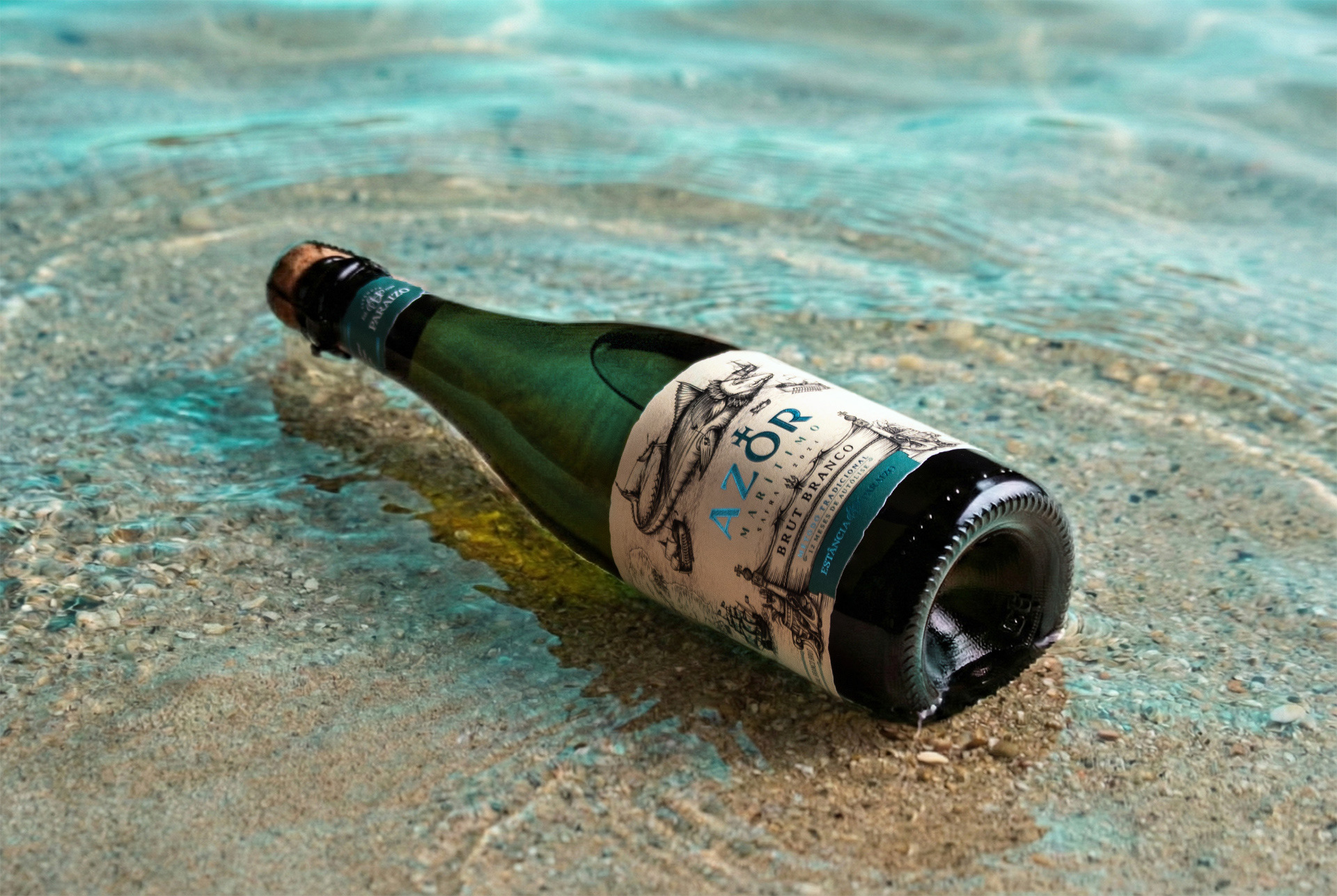
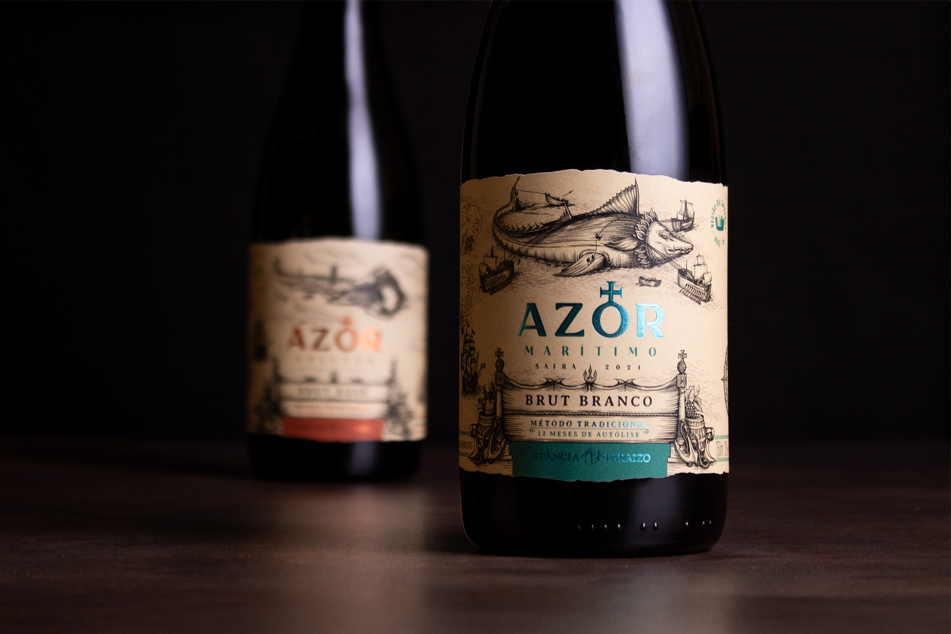
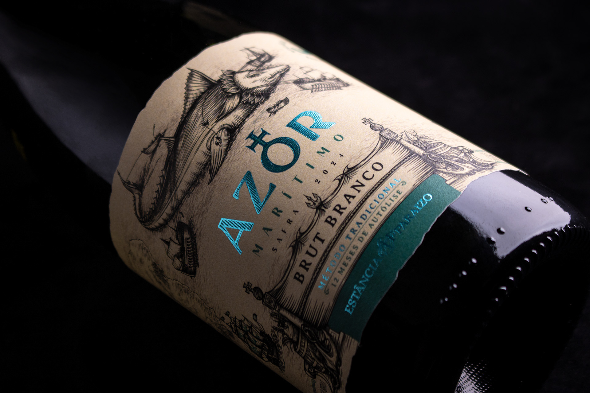
Já no Azor Marítimo representa a travessia do Oceano Atlântico até a Colônia de Sacramento, no Uruguai, retratando o Brasil Imperial de 1690. O personagem central mescla o imaginário do ser “Balena” dos mapas antigos com o atum, peixe emblemático da cultura açoriana, simbolizando os perigos e fascínios do mar aberto.
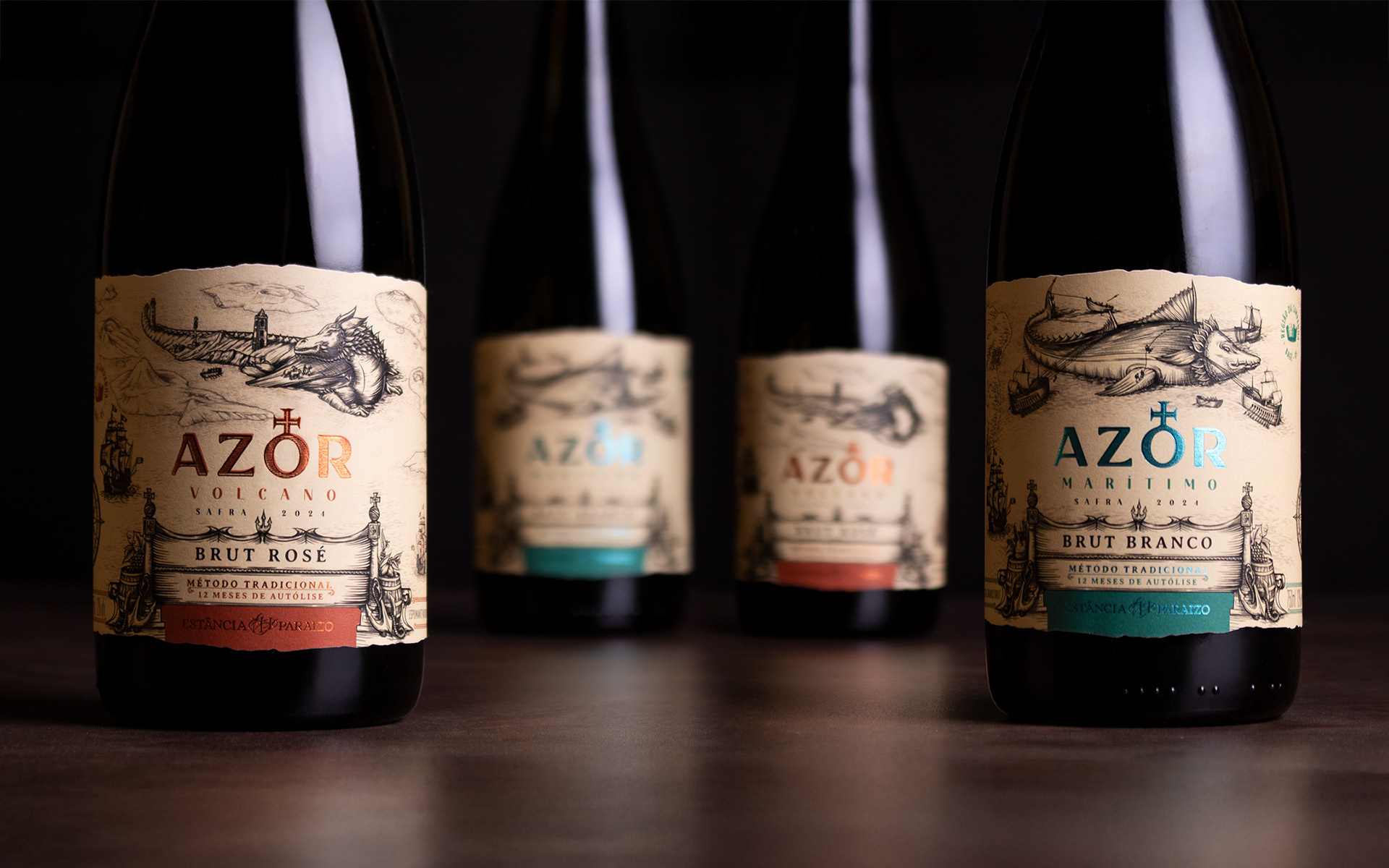
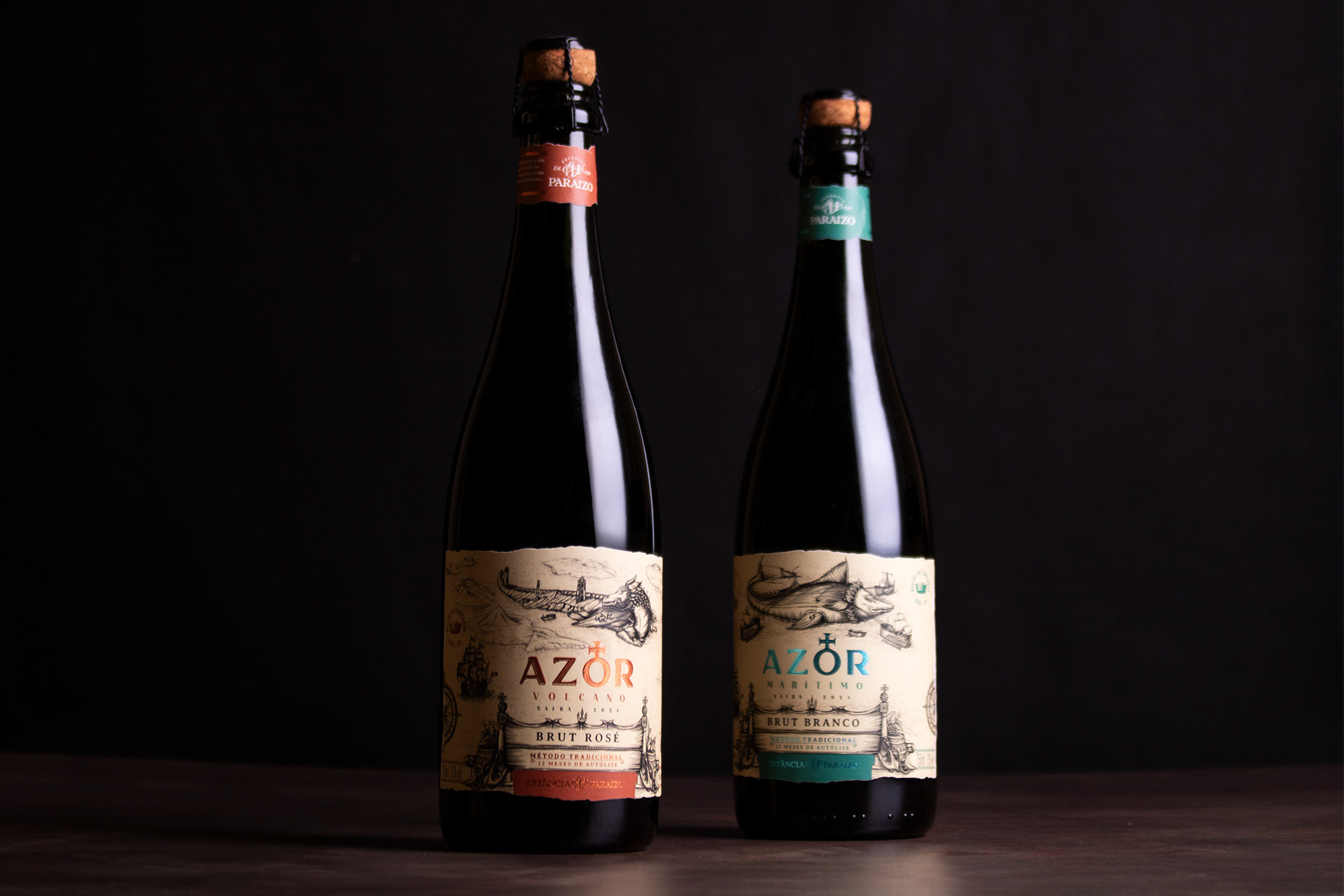
Para reforçar essa narrativa, optamos por um papel texturizado de tom envelhecido, com corte irregular, remetendo a mapas antigos e documentos guardados pelo tempo. Os acabamentos em hot-stamping enobrecem os produtos, instigam o imaginário e diferenciam os produtos através das cores.
As ilustrações receberam serigrafia fosca, onde o relevo destaca os personagens e cria uma experiência tátil, além de verniz de proteção contra a umidade. O resultado são rótulos que não apenas embalam um espumante, mas contam uma história, onde o design e a ilustração se unem para homenagear o passado e dar voz a uma história que atravessou o oceano.
AZOR - ESTÂNCIA PARAIZO - LABELS
The Azor Volcano and Azor Marítimo labels are born as two parts of the same narrative: the origin and epic journey of the Mercio family, from the Azores Archipelago in the middle of the Atlantic Ocean to southern Brazil. Inspired by old maps from the 16th and 17th centuries, the period of the great navigations, the labels are structured like two parts of a map, where each bottle reveals a chapter of this story of overcoming, courage, and pioneering spirit.
In Azor Volcano, the story begins in the homeland, the archipelago with 9 islands, highlighting the island of São Jorge. The dragon we illustrate is part of the terrain, transforming itself into the island. Both the dragon and the volcano allow people to build, cultivate, and live on their surface, but they have the power at any moment to erupt and claim their territory and hegemony. Symbolic elements of Portuguese navigation, such as the Armillary Sphere and the Maltese Cross, reinforce the historical context and are the main reference for creating the AZOR brand, while the color palette and finishes evoke the materiality of the land, fire, and myths surrounding the archipelago.
The Azor Maritime design represents the crossing of the Atlantic Ocean to Colonia del Sacramento, Uruguay, portraying Imperial Brazil in 1690. The central character blends the imagery of the "Balena" (whale) from old maps with the tuna, an emblematic fish of Azorean culture, symbolizing the dangers and fascinations of the open sea.
To reinforce this narrative, we opted for a textured paper with an aged tone and irregular cut, reminiscent of old maps and documents preserved over time. Hot-stamping finishes enhance the products, stimulate the imagination, and differentiate them through color.
The illustrations received a matte screen printing finish, where the relief highlights the characters and creates a tactile experience, in addition to a protective varnish against moisture. The result is labels that not only package a sparkling wine, but tell a story, where design and illustration come together to honor the past and give voice to a story that crossed the ocean.
Client: Estância Paraizo
Project: Label Design and Illustration
Images: Bagual Studio
Project: Label Design and Illustration
Images: Bagual Studio